top button
Flag Notify
    Connect to us
      Site Registration

Site Registration

First Animations Using XAML and Silverlight - Color Animation: Part I

+5 votes
337 views

Visual Studio 2008 and .Net framework 3.5 provide us several new features not found in the precedent version. The WPF, the XAML and Silverlight are among the new features introduced in a WPF context. They contribute to the amelioration of the application ergonomic side by introducing something new like 2D/3D animations. For instance, Visual studio 2008 and Silverlight products must be installed before starting with animations. For me, this is my first experience within VS 2008, XAML, WPF and Silverlight.  

As you will see, a given animation can target a given control such as a rectangle, a grid or an even a button witches are called canvas. The animation by definition is this context is the given control property or properties changement from given statue to another via an interpolation that could be monitored by the developer via code xaml or via the page code behind. I mean C # code. It is similar phenomenon when comparing with the flash animations, if you have already dealt with flash projects especially the movement and the form interpolations. There are three main animations in addition to a set of witches those provided by the System.Window.Media.Animation namespace,  all could be used in order to achieve a particular goal, but in this article and the ones witches will follow this one,  we'll concentrate on the three kind of animations, namely the Double animation, the Color animation and the point animation, moreover, the .Net frameworks provides a set of base classes such DoubleAnimationBase, ColorAnimationBase and PointAnimationBase to customize your code in addition to other classes like Aniamtable and interfaces such as IAnimatable. All of them are provided to perform customized animations within your WPF application.

In this article, I will give a trick of how to deal with ColorAnimation class within VS2008 and Silverlight context using both xaml and C# 4.0, afterward, and in the two subsequent articles, we'll focus on the DoubleAnimation and PointAnimation:

The Color animation:

In this example we will define a rectangle that changes color from yellow to red if the mouse enters the given object boundaries and then returns to the first color if the mouse leaves the rectangle.

XAML code:

Create a new WPF application by open New>Project>WPFApplication then name your application my first WPF application. Copy and paste this under code to the xaml zone.

<Window x:Class="myWpfApplication.Window1"

    xmlns="http://schemas.microsoft.com/winfx/2006/xaml/presentation"

    xmlns:x="http://schemas.microsoft.com/winfx/2006/xaml"

    Title="Window1" Height="400" Width="400" Loaded="Window_Loaded">

<!—The rectangle extends the Animatable class so it can be target of an

 Animation therefore a chose it -->

    <Rectangle Width="250" Height="250" ToolTip="This is myRectangle" Name="myRectangle"Visibility="Visible" Fill="Yellow">

        <Rectangle.Triggers>

             <!—The mouse enter event is the one that triggers the animation -->

            <EventTrigger RoutedEvent="Rectangle.MouseEnter">

            <!—The Storyboard is a sort of aniamtion container-->

                <BeginStoryboard>

                    <Storyboard>

                    <!—The color, the duration, and the targeted property that will

                       Be subject of the aniamtion, all parameters are set within the animation tag  -->

                        <ColorAnimation Storyboard.TargetName="myRectangle"

                                         Storyboard.TargetProperty="(Fill).(Color)"

                                         Duration="00:00:08"

                                         From="Yellow" To="Red"                                  

                                         />

                    </Storyboard>

                </BeginStoryboard>

            </EventTrigger>

            <!—As you see, you can implement more that one animation for the same

               Object at the same time -->

          <EventTrigger RoutedEvent="Rectangle.MouseLeave">

                <BeginStoryboard>

                    <Storyboard>

                        <ColorAnimation Storyboard.TargetName="myRectangle"Storyboard.TargetProperty="(Fill).(Color)"

                                        Duration="00:00:08" From="Red" To="Yellow"

                                        />

                    </Storyboard>

                </BeginStoryboard>

            </EventTrigger>

        </Rectangle.Triggers>

    </Rectangle>

</Window>

C# code:

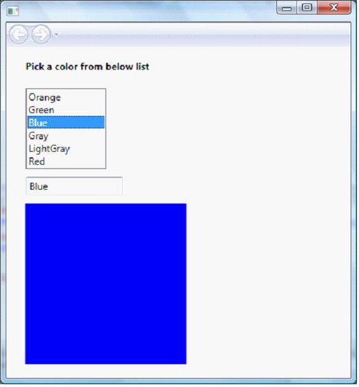
Also this task could be performed using the form code behind, I mean C#, to do so open a new window drag and drop a new rectangle.

Figure 1

Then right click on it and choose the properties menu.

Figure 2

Afterward, select the properties menu item and set it property name to "myRectangle" width to "250" and it height to "250".

Then implement the code as bellow, but don't forget to append System.Windows.Media.Animation namespace to the project:

//It is used to fill myRectangle object

SolidColorBrush TransformBrush;

//This animation is for changing the color

ColorAnimation oColorAnimation;

private void Window_Loaded(object sender, RoutedEventArgs e)

{

//First we set the color to yellow

TransformBrush = new SolidColorBrush(Colors.Yellow);

//Fill the rectangle using the TransformBrush

myRectangle.Fill = TransformBrush;

//Those two lines are responsibles for triggering events MouseEnter and MouseLeave

myRectangle.MouseEnter+=new MouseEventHandler(myRectangle_MouseEnter);

myRectangle.MouseLeave+=new MouseEventHandler(myRectangle_MouseLeave);

}

private void myRectangle_MouseEnter(object sender, RoutedEventArgs e)

{

//Set the animation

oColorAnimation = new ColorAnimation();


//The initial brush state

oColorAnimation.From = Colors.Yellow;

//The final brush state

oColorAnimation.To = Colors.Red;

//The animation duration

oColorAnimation.Duration = TimeSpan.FromSeconds(8);

//Trigger the animation

TransformBrush.BeginAnimation(SolidColorBrush.ColorProperty, oColorAnimation);


}

private void myRectangle_MouseLeave(object sender, RoutedEventArgs e)

{

//Set the animation

oColorAnimation = new ColorAnimation();

//The initial brush state

oColorAnimation.From = Colors.Red;

//The final brush state

oColorAnimation.To = Colors.Yellow;

//The animation duration

oColorAnimation.Duration = TimeSpan.FromSeconds(8);

//Trigger the animation

TransformBrush.BeginAnimation(SolidColorBrush.ColorProperty, oColorAnimation);


posted Nov 18, 2015 by Jdk

  Promote This Article
Facebook Share Button Twitter Share Button LinkedIn Share Button


Related Articles

In this article, I will try to make a representation of the Grid object witch is directly derived from the Panel abstract class and we can say that is a flexible area that contains rows and columns, it plays a role of container in a given WPF window. The grid could be found in the PresentationFramework assembly. The grid control could be used to create a complex layout that gives to the application an attractive and ergonomic look. So let's discover how to configure it using XAML in this part and in second part I will illustrate how to perform the same task using the code behind, I mean C#.

At first look, when a new WPF application is defined, we have the impression that there is not controls but the window one, even if the "<Grid></Grid>" tags are presents, and the first question that one can ask is where are the grid lines if it is a grid really? 


Figure 1

I tell you ok try this code:

<Grid ShowGridLines="True">

        <Grid.RowDefinitions>

            <RowDefinition></RowDefinition>

            <RowDefinition></RowDefinition>

            <RowDefinition></RowDefinition>

        </Grid.RowDefinitions>

        <Grid.ColumnDefinitions>

            <ColumnDefinition></ColumnDefinition>

            <ColumnDefinition></ColumnDefinition>

            <ColumnDefinition></ColumnDefinition>

        </Grid.ColumnDefinitions>       

    </Grid>

I use the <Grid.RowDefinitions> to define a collection of rows and a<Grid.ColumnDefinitions> to define columns collection. In the other hand I use<RowDefinition> to define a row element within the grid control and <ColumnDefinition> to define a column element, and then I set ShowGridLines property to true, it is very important in order to render columns and rows visible. The result will be as follows:

Figure 2

The columns and rows definition mode could be, namely star, Auto or Pixel.

The Star definition

It means that the related size could be expressed as weighted proportion of available space, for example if a size of a given first row is double of a second given row size, then the first one will receive two units of the entire grid size, meanwhile, the second one will have one unit as size. Rows and columns sizes are expressed by this symbol * that represents a unit of size. The XAML code sample illustrates how to define a size based on star definition.

<Grid ShowGridLines="True" >

        <Grid.RowDefinitions>

            <RowDefinition></RowDefinition>

            <RowDefinition></RowDefinition>

            <RowDefinition></RowDefinition>

        </Grid.RowDefinitions>

        <Grid.ColumnDefinitions>

            <ColumnDefinition Width="2*"></ColumnDefinition>

            <ColumnDefinition></ColumnDefinition>

            <ColumnDefinition></ColumnDefinition>

        </Grid.ColumnDefinitions>       

    </Grid>

The result of the above code is:

Figure 3

The above code sets the first column width as double of the reset of the columns.

The Pixel definition

It means that the size is defined in terms of pixels such as in the ASP applications. This bellow code illustrate how to define a dimension of a given column or row based on pixels

<Grid ShowGridLines="True" >

        <Grid.RowDefinitions>

            <RowDefinition></RowDefinition>

            <RowDefinition></RowDefinition>

            <RowDefinition></RowDefinition>

        </Grid.RowDefinitions>

        <Grid.ColumnDefinitions>

            <ColumnDefinition Width="100px"></ColumnDefinition>

            <ColumnDefinition></ColumnDefinition>

            <ColumnDefinition></ColumnDefinition>

        </Grid.ColumnDefinitions>       

    </Grid>

And this is a presentation of what could be if such alternative is used

Figure 4

The Auto definition

It means that the size is proportional to the content object size. Once the column or the row width or height is set to auto and there is no object contained with it. It disappears from the grid but it doesn't mean that it is deleted. If you add controls within, it takes exactly the control dimension. For example, if we make a rectification of the previous code

<Grid ShowGridLines="True" >

        <Grid.RowDefinitions>

            <RowDefinition></RowDefinition>

            <RowDefinition></RowDefinition>

            <RowDefinition></RowDefinition>

        </Grid.RowDefinitions>

        <Grid.ColumnDefinitions>

            <ColumnDefinition Width="Auto"></ColumnDefinition>

            <ColumnDefinition></ColumnDefinition>

            <ColumnDefinition></ColumnDefinition>

        </Grid.ColumnDefinitions>       

    </Grid>

The grid appearance will be

Figure 5

Cut  Width="Auto"  then drag and drop a button into the grid and make sure that it is contained within the row 0 , column 0 grid cellule and this is the XAML button code.

<Button Grid.Column="0" Grid.Row="0" Width="100" Name="button1">Button</Button>

Now, paste Width="Auto" exactly in its previous place and you will observe this. As you see the button is clipped rather that scrolled.

Figure 6


READ MORE

This tutorial shows you how to create an animation of a ball being thrown across the screen, landing and bouncing.

Step by Step Tutorial

A brief description of how to use the article or code. The class names, the methods and properties, any tric

  1. Create a new project in Expression Blend. 
     
  2. Draw an ellipse and name the ellipse "ball" 

    image001.jpg
     
  3. The key to creating a bounce effect is to realize that in physics the vertical motion of a ball in motion is completely independent of the horizontal motion. What we're going to do is create two separate story boards for each of these independent motions and then we're going to go into the XAML and combine them into one storyboard. 
     
  4. Create a new storyboard called "Bounce" 
     
  5. Record a keyframe at time 0 for the ball to capture the current position. Then drag the yellow timeline bar to the 1 second position. 

    image002.jpg


  1. Now drag the red ball directly up. And record a key frame. At the one second point. Hit play and you should see the ball move directly up at a smooth rate and then stop. 

    image003.jpg


  1. Now let's add some gravity. Click on the second keyframe bubble of the storyboard. Set the easing as shown below. This will make the motion slow down as the ball gets to the top of its motion. Confirm this by playing the storyboard. Once you've confirmed this close out the storyboard. 

    image004.jpg


  1. Create a storyboard called Horizontal. Create a keyframe at 0 seconds, and then set the timeline to 2 seconds. Drag the ball horizontally to the right and create a keyframe at the 2 second point. Close out the storyboard. 

    image005.jpg


  1. Now let's look at the XAML for the Bounce storyboard. Unless you drug the ball perfectly vertically you'll have two sections in the storyboard, one for animating the x direction and one for animation the y direction. You can tell which is which by looking for the line that ends TranslateTransform.Y or TranslateTransform.X. Delete the section that handles the X motion. 
     
  2. Now let's make the ball return to it's starting point. 

    Here's the XAML before hand:

    image006.jpg

    Notice it's moving the ball from a position of 0 to a position of -206 in 1 second. ControlPoint1's value of 0,1 indicates we are going to start at full speed and reach minimum speed at the end of the motion. To make the ball return back down we'll copy the second keyframe, change to time of the key to 2 seconds, change the destination of the animation to 0, and we'll reverse the sense of the easing defined by ControlPoint2. The results are as follows:

    image007.jpg

    Select the bounce storyboard and hit play. You should see the ball go up and down as if it's been thrown up and down.
     
  3. Now let's add the X motion. Take a look at second storyboard we made earlier called horizontal. Copy the DoubleAnimationUsingKeyFrames section that ends TranslateTransform.X and paste it into the Bounce storyboard. Open the bounce storyboard from the design review and hit play. You should see the ball move in a nice smooth arc as if it has been thrown. 

    image008.jpg


  1. To add a bounce we simply follow the same pattern and add additional key frames. To the DoubleAnimationUsingKeyFrames section that ends TranslateTransform.X add one more keyframe at 3 seconds by adding the following XAML: 

    <SplineDoubleKeyFrame KeyTime="00:00:03" Value="320"/>

    This XAML sets the position that the ball will move to at the end of the third second to 320 which is 22 to the right of where it was in at the end of the previous keyframe. For the vertical portion of the bounce copy the last two keyframes of the DoubleAnimationUsingKeyFrames section that ends TranslateTransform.Y. Set the keyframe time for the peak of the bounce to 2.5 seconds and a height of -20. Have the bounce return to 0 at 3 seconds. This results in the addition of the following XAML:

    <SplineDoubleKeyFrame KeyTime="00:00:02.5" Value="-20">
    <SplineDoubleKeyFrame.KeySpline>
    <KeySpline ControlPoint1="0,1" ControlPoint2="1,1"/>
    </SplineDoubleKeyFrame.KeySpline>
    </SplineDoubleKeyFrame>
    <SplineDoubleKeyFrame KeyTime="00:00:03" Value="0">
    <SplineDoubleKeyFrame.KeySpline>
    <KeySpline ControlPoint1="1,0" ControlPoint2="1,1"/>
    </SplineDoubleKeyFrame.KeySpline>
     
  2. To make the throw occur over and over add a RepeatBehavior to the Storyboard. 

    <Storyboard RepeatBehavior="Forever" x:Name="Bounce">
     
  3. Finally let's add code to start the throw on the load of the page 

    public Page() 

    // Required to initialize variables 
    InitializeComponent(); 
    Loaded += new RoutedEventHandler(PageLoaded); 


    void PageLoaded(object sender, RoutedEventArgs e) 

    Bounce.Begin(); 
    }

     
  4. That's it. Hit F5 and you should see the ball being thrown and bouncing.
READ MORE

Calendar Events

Besides the normal control events, the Calendar control has three events calendar related events. These events are the DisplayDateChanged, DisplayModeChanged and SelectedDatesChanged. The DisplayDateChanged event is fired where the DisplayDate property is changed. The DisplayModeChanged event is fired when the DisplayMode property is changed. The SelectedDatesChanged event is fired when the SelectedDate or SelectedDates properties are changed. The following code snippet sets these three events attributes. 

<Calendar SelectionMode="SingleRange"  
   Name="MonthlyCalendar"   
   SelectedDatesChanged="MonthlyCalendar_SelectedDatesChanged"  
   DisplayDateChanged="MonthlyCalendar_DisplayDateChanged"  
   DisplayModeChanged="MonthlyCalendar_DisplayModeChanged"  
   HorizontalAlignment="Left"  
   VerticalAlignment="Top"  
   Margin="10,10,0,0">   
</Calendar>   

The code behind for these events look as in Listing 4. 

private void MonthlyCalendar_SelectedDatesChanged(object sender,   
    SelectionChangedEventArgs e)  
{  
}  
private void MonthlyCalendar_DisplayDateChanged(object sender,   
    CalendarDateChangedEventArgs e)  
{  
}  
private void MonthlyCalendar_DisplayModeChanged(object sender,   
    CalendarModeChangedEventArgs e)  
{  
 

Listing 4

Normally, on a date selection, you may want to capture that event and know what the current selected date is. Now how about we add a TextBox control to the page and on the date selection, we will set the text of the TextBox to the currently selected date. 

We add the following code to the XAML just below the Calendar control. <TextBox Width="200" Height="30"  
   VerticalAlignment="Bottom"  
   HorizontalAlignment="Left"  
   Margin="10,10,10,10"  
   x:Name="SelectedDateTextBox">  
</TextBox>

On the SelectedDateChanged event handler, we set the TextBox.Text property to the SelectedDate property of the Calendar control as you can see from the code in Listing 5. 

private void MonthlyCalendar_SelectedDatesChanged(object sender,   
    SelectionChangedEventArgs e)  
{  
    SelectedDateTextBox.Text = MonthlyCalendar.SelectedDate.ToString();  

Listing 5

Now when you run the application, you will see the output that looks as in Figure 10. When you select a date in the Calendar, it will be displayed in the TextBox. 


Figure 10

Formatting a Calendar


How about we create a Calendar control with a border formatting, background and foreground of the Calendar?

The BorderBrush property of the Calendar sets a brush to draw the border of a Calendar. You may use any brush to fill the border. The following code snippet uses a linear gradient brush to draw the border with a combination of the colors Red and Blue.

<Calendar.BorderBrush>  
   <LinearGradientBrush StartPoint="0,0" EndPoint="1,1" >  
      <GradientStop Color="Blue" Offset="0" />  
      <GradientStop Color="Red" Offset="1.0" />  
   </LinearGradientBrush>  
</Calendar.BorderBrush>  

The Background and Foreground properties of the Calendar set the background and foreground colors of a Calendar. You may use any brush to fill the border. The following code snippet uses linear gradient brushes to draw the background and foreground of a Calendar. 

<Calendar.Background>  
    <LinearGradientBrush StartPoint="0,0" EndPoint="1,1" >  
        <GradientStop Color="Blue" Offset="0.1" />  
        <GradientStop Color="Orange" Offset="0.25" />  
        <GradientStop Color="Green" Offset="0.75" />  
        <GradientStop Color="Red" Offset="1.0" />  
    </LinearGradientBrush>  
</Calendar.Background>  
<Calendar.Foreground>  
    <LinearGradientBrush StartPoint="0,0" EndPoint="1,1" >  
        <GradientStop Color="Black" Offset="0.25" />  
        <GradientStop Color="Green" Offset="1.0" />  
    </LinearGradientBrush>  
</Calendar.Foreground>  

The new Calendar looks as in Figure 11. 


Figure 11

Setting Image as Background of a Calendar


To set an image as the background of a Calendar, we can set an image as the Background of the Calendar. The following code snippet sets the background of a Calendar to an image. The code also sets the opacity of the image.

<Calendar.Background>  
   <ImageBrush ImageSource="Garden.jpg" Opacity="0.3"/>  
</Calendar.Background>  

The new output looks as in Figure 12.


Figure 12

Creating a Calendar Dynamically


The code listed in Listing 6 creates a Calendar control programmatically. First, it creates a Calendar object and sets its DisplayMode and SelectedMode and other properties and later the Calendar is added to the LayoutRoot. 

private void CreateDynamicCalendar()  
{  
    Calendar MonthlyCalendar = new Calendar();  
    MonthlyCalendar.Name = "MonthlyCalendar";  
    MonthlyCalendar.Width = 300;  
    MonthlyCalendar.Height = 400;  
    MonthlyCalendar.Background = Brushes.LightBlue;  
    MonthlyCalendar.DisplayMode = CalendarMode.Month;  
    MonthlyCalendar.SelectionMode = CalendarSelectionMode.SingleRange;  
    MonthlyCalendar.DisplayDateStart = new DateTime(2010, 3, 1);  
    MonthlyCalendar.DisplayDateEnd = new DateTime(2010, 3, 31);  
    MonthlyCalendar.SelectedDates.Add(new DateTime(2010, 3, 5));  
    MonthlyCalendar.SelectedDates.Add(new DateTime(2010, 3, 15));  
    MonthlyCalendar.SelectedDates.Add(new DateTime(2010, 3, 25));    
    MonthlyCalendar.FirstDayOfWeek = DayOfWeek.Monday;  
    MonthlyCalendar.IsTodayHighlighted = true;    
    LayoutRoot.Children.Add(MonthlyCalendar);  
}  

Listing 6

Summary


In this article, I discussed the calendar control using XAML and C#. We also saw how to set display modes, selection modes, blackout dates, selected dates, border, background and foreground properties. After that, we saw you to set an image as the background of a Calendar. In the end of this article, we saw how to create a Calendar dynamically.

READ MORE

The following code snippet adds blackout dates to a Calendar. 

<Calendar.BlackoutDates>  
   <CalendarDateRange Start="3/1/2010" End="3/7/2010"/>  
   <CalendarDateRange Start="3/8/2010" End="3/8/2010"/>  
   <CalendarDateRange Start="3/15/2010" End="3/15/2010"/>  
   <CalendarDateRange Start="3/22/2010" End="3/22/2010"/>  
   <CalendarDateRange Start="3/29/2010" End="3/29/2010"/>  
</Calendar.BlackoutDates>  

We can do this by adding the code listed in Listing 2. As you can see from Listing 3, the BlackoutDates.Add method takes a CalendarDateRange object, that is a collection of two DateTime objects. The first date is the start date of the range and the second date is the end date of the date range. 

private void SetBlackOutDates()  
{  
    MonthlyCalendar.BlackoutDates.Add(new CalendarDateRange(  
        new DateTime(2010, 3, 1),  
        new DateTime(2010, 3, 7)  
        ));  
    MonthlyCalendar.BlackoutDates.Add(new CalendarDateRange(  
        new DateTime(2010, 3, 8),  
        new DateTime(2010, 3, 8)  
        ));  
    MonthlyCalendar.BlackoutDates.Add(new CalendarDateRange(  
      new DateTime(2010, 3, 15),  
      new DateTime(2010, 3, 15)  
      ));  
    MonthlyCalendar.BlackoutDates.Add(new CalendarDateRange(  
      new DateTime(2010, 3, 22),  
      new DateTime(2010, 3, 22)  
      ));  
    MonthlyCalendar.BlackoutDates.Add(new CalendarDateRange(  
      new DateTime(2010, 3, 29),  
      new DateTime(2010, 3, 29)  
      ));  
}  

Listing 2

DisplayDateStart and DisplayDateEnd


The Calendar control allows you to set the start and end display dates using the DisplayDateStart and DisplayDateEnd properties. If you see Figure 5 in the previous section, you may notice the March 2010 month calendar display starts with the March 01, 2010 date. But now, what if you want to display the dates for only the month of March 2010? We can use the DisplayStartDate and DisplayEndDate properties to control the start and end dates of a month. 

DisplayDate property represents the current date to display. 

The following code snippet sets the DisplayDate, DisplayDateStart and DisplayDateEnd attributes of the Calendar element in XAML.

<Calendar Name="MonthlyCalendar"   
   SelectionMode="MultipleRange"   
   DisplayDate="3/1/2010"  
   DisplayDateStart="3/1/2010"  
   DisplayDateEnd="3/31/2010"  
/>  

The code listed in Listing 3 makes sure the start date is March 01, 2010 and end date is March 31, 2010. The current selected date is March 05. 

private void SetDisplayDates()  
{  
   MonthlyCalendar.DisplayDate = new DateTime(2010, 3, 5);  
   MonthlyCalendar.DisplayDateStart = new DateTime(2010, 3, 1);  
   MonthlyCalendar.DisplayDateEnd = new DateTime(2010, 3, 31);  
 

Listing 3

The new calendar looks as in Figure 6. 


Figure 6

FirstDayOfWeek and IsTodayHighlighted

By default, Sunday is the first day of the week. If you would like to change it, you use the FirstDayOfWeek property. The IsTodayHightlighted property is used to highlight today. 

The following code snippet sets the FirstDayOfWeek to Tuesday and makes today highlighted.

<Calendar Name="MonthlyCalendar"   
   SelectionMode="MultipleRange"   
   DisplayDate="3/5/2010"  
   DisplayDateStart="3/1/2010"  
   DisplayDateEnd="3/31/2010"  
   FirstDayOfWeek="Tuesday"  
   IsTodayHighlighted="True"   
   xmlns:sys="clr-namespace:System;assembly=mscorlib" Margin="15,39,88,19">  

The following code snippet sets the FirstDayOfWeek to Tuesday and makes today highlighted in WPF.

MonthlyCalendar.FirstDayOfWeek = DayOfWeek.Tuesday;  
MonthlyCalendar.IsTodayHighlighted = true;

The new calendar looks as in Figure 7, where you can see the start day of the week is Tuesday.


Figure 7

Selected Date and Selected Dates


The SelectedDate property represents the current selected date. If multiple date selection is true then the SelectedDates property represents all the selected dates in a Calendar. The following code snippet sets the SelectedDates in XAML at design-time. 

<Calendar Name="MonthlyCalendar"   
    SelectionMode="MultipleRange"    
    DisplayDate="3/5/2010"  
    DisplayDateStart="3/1/2010"  
    DisplayDateEnd="3/31/2010"  
    FirstDayOfWeek="Tuesday"  
    IsTodayHighlighted="True"   
    xmlns:sys="clr-namespace:System;assembly=mscorlib" Margin="15,39,88,19">    
    <Calendar.SelectedDates>  
        <sys:DateTime>3/5/2010</sys:DateTime>  
        <sys:DateTime>3/15/2010</sys:DateTime>  
        <sys:DateTime>3/25/2010</sys:DateTime>  
     </Calendar.SelectedDates>    
</Calendar>  

The selected dates in a Calendar looks as in Figure 8 where you can see March 5th, 15th and 25th have a light blue background and represents the selected dates. 


Figure 8

The following code snippet sets the SelectedDates property in WPF at run-time. 

private void AddSelectedDates()  
{  
   MonthlyCalendar.SelectedDates.Add(new DateTime(2010, 3, 5));  
   MonthlyCalendar.SelectedDates.Add(new DateTime(2010, 3, 15));  
   MonthlyCalendar.SelectedDates.Add(new DateTime(2010, 3, 25));  
}  

Note: If you have set the selected dates to any of the blackout dates, you will see the parser in XAML will throw an error as in Figure 9. 


Figure 9

READ MORE

A calendar control is used to create a visual calendar that lets users pick a date and fire an event on the selection of the date. This article demonstrates how to create and use a calendar control using XAML and C# in WPF.

Creating a Calendar

The Calendar element represents a calendar control in XAML as in the following:

  1. <Calendar/>  

The Calendar control is defined in the System.Windows.Controls namespace. When you drag and drop a Calendar control from the Toolbox to the page, the XAML code will look like the following code where you can see a Calendar XAML element has been added within the Grid element and its Width, Height, Name and VerticalAlignment and HorizontalAlignment attributes are set.

  1. <Grid>  
  2.    <Calendar Height="170" HorizontalAlignment="Left" Margin="58,32,0,0"   
  3.       Name="calendar1" VerticalAlignment="Top" Width="180" />  
  4. </Grid>  

The default view of the Calendar control looks as in Figure 1. 


Figure 1

The Width and Height attributes of the Calendar element represent the width and the height of a Calendar. The Content attribute represents the text of a Calendar. The Name attribute represents the name of the control, that is a unique identifier of a control. 

The code snippet in Listing 1 creates a Calendar control and sets the name, height and width properties of a Calendar control. 

  1. <Calendar Name=" MonthlyCalendar" Height="30" Width="100" >  
  2. </Calendar>  

Listing 1

Display Modes

The DisplayMode property of the Calendar class represents the format of the display of a Calendar, that can be a month, year, or decade. Month is the default mode. Setting the DisplayMode to Year and Decade generates Figure 2 and Figure 3 respectively. 


Figure 2


Figure 3


The Month view that is also the default view looks as in Figure 4.


Figure 4

If you use an example of the Decade and click on the year 2008 in Figure 3, you will get another Calendar format with all the months in the year 2008 and if you click on any month, you will eventually get the month view of the Calendar. 

The following code snippet sets the DisplayMode property to Decade. 

  1. <Calendar DisplayMode="Decade">   
  2. </Calendar>  

Selection Modes and Selection Dates

The SelectedDate property represents the currently selected date. If multiple dates selection is true, the SelectedDates property represents a collection of currently selected dates. 

The SelectionMode of type CalendarSelectionMode enumeration represents the selection mode of calendar. Table 1 describes the CalendarSelectionMode enumeration and its members. 
 

CalendarSelectionModeDescription
NoneNo selections are allowed.
SingleDateOnly a single date can be selected, either by setting SelectedDate or the first value in SelectedDates. AddRange cannot be used.
SingleRangeA single range of dates can be selected. Setting SelectedDate, adding a date individually to SelectedDates, or using AddRange will clear all previous values from SelectedDates.
MultipleRangeMultiple non-contiguous ranges of dates can be selected. Adding a date individually to SelectedDates or using AddRange will not clear SelectedDates. Setting SelectedDate will still clear SelectedDates, but additional dates or range can then be added. Adding a range that includes some dates that are already selected or overlaps with another range results in the union of the ranges and does not cause an exception.

The following code snippet sets the SelectionMode property to a single range.

  1. <Calendar SelectionMode="SingleRange">  
  2. </Calendar>  

BlackoutDates

The BlackoutDates property of the Calendar class represents a collection of dates that are not available for selection. All non-selection dates are marked by a cross. For example, say in the month of March of the year 2010, we would like to block the dates from Jan 1st to Jan 7th and then all Sundays and the final calendar should look as in Figure 5.


Figure 5

Part 2 Continuous..

READ MORE

PART 5: Continues 

To bind an XmlDataProvider, we set the Source property inside the ItemsSource of a TreeView to the x:Keyof XmlDataProvider and the code in the code is used to filter the data. In the TreeView.ItemTempate, we use the Binding property. 

             <TreeView.ItemsSource>  
        <Binding Source="{StaticResource BooksData}"  
       XPath="*[@Category='Programming'] "/>  
    </TreeView.ItemsSource>    
    <TreeView.ItemTemplate>  
        <DataTemplate>  
            <StackPanel Orientation="Horizontal">  
                <TextBlock Text="Title: " FontWeight="Bold"/>  
                <TextBlock Foreground="Green"  >  
                    <TextBlock.Text>   
                        <Binding XPath="Title"/>  
                    </TextBlock.Text>                        
                </TextBlock>                       
           </StackPanel>  
        </DataTemplate>  
    </TreeView.ItemTemplate>  
</TreeView> 

The output of the preceding code looks as in the following.

xml data binding
                                                               Figure 11

The last data binding type we will see is how to provide data exchange between a TreeView and other controls using data binding in WPF.

We will create an application that looks as in the following. I have a TreeView with a list of colors, aTextBox and a Canvas. When we pick a color from the TreeView, the text of the TextBox and color of the Canvas changes dynamically to the color selected in the TreeView. This is possible to do all in XAMLwithout writing a single line of code in the code behind file.

code in the code
                                                           Figure 12.

The XAML code of the page looks as in the following:


<StackPanel Orientation="Vertical">  
    <TextBlock Margin="10,10,10,10" FontWeight="Bold">  
        Pick a color from below list  
    </TextBlock>  
    <TreeView Name="mcTreeView" Height="100" Width="100"  
             Margin="10,10,0,0" HorizontalAlignment="Left" >  
        <TreeViewItem>Orange</TreeViewItem>  
        <TreeViewItem>Green</TreeViewItem>  
        <TreeViewItem>Blue</TreeViewItem>  
        <TreeViewItem>Gray</TreeViewItem>  
        <TreeViewItem>LightGray</TreeViewItem>  
        <TreeViewItem>Red</TreeViewItem>  
    </TreeView>   
   <TextBox Height="23" Name="textBox1" Width="120" Margin="10,10,0,0" HorizontalAlignment="Left"  >  
        <TextBox.Text>  
            <Binding ElementName="mcTreeView" Path="SelectedItem.Content"/>  
        </TextBox.Text>  
    </TextBox>  
    <Canvas Margin="10,10,0,0" Height="200" Width="200" HorizontalAlignment="Left" >  
        <Canvas.Background>  
            <Binding ElementName="mcTreeView" Path="SelectedItem.Content"/>  
        </Canvas.Background>  
    </Canvas>    
</StackPanel>  

If you look at the TextBox XAML code, you will see the Binding within the TextBox.Text property that sets the binding from the TextBox to another control. Another control ID is ElementName and another control's property is Path. So in the following code, we are setting the SelectedItem.Content property of theTreeView to the TextBox.Text property.    

     <TextBox.Text>  
     <Binding ElementName="mcTreeView" Path="SelectedItem.Content"/>  
   </TextBox.Text>  

The same applies to the Canvas.Background property, where we set it to the SelectedItem.Content of theTreeView. Now, every time you select an item in the TreeView, the TextBox.Text and Canvas.Backgroundproperties are set to the selected item in the TreeView.

  1. <Canvas.Background>  
        <Binding ElementName="mcTreeView" Path="SelectedItem.Content"/>  
    </Canvas.Background>  

Summary

In this article, I exlained how to create and use a TreeView control available in WPF. We saw how to add items to a TreeView, change item properties, add images and add check boxes. In the end of this article, we saw how data binding works for a TreeView and how to bind a TreeView with data coming from objects, a database and other controls. 

READ MORE

Part 4: Continues

We will read ContactName, Address, City and Country columns in a WPF TreeView control. The finalTreeView looks as in the following: 

final TreeView

Now let's look at our XAML file. We create a resources DataTemplate type called TreeViewTemplate. A data template is used to represent data in a formatted way. The data template has two dock panels where the first panel shows the name and the second panel shows the address, city and country columns by using TextBlock controls. 

  1. <Window.Resources>  
        <DataTemplate x:Key="TreeViewTemplate">  
            <StackPanel Margin="3">  
                <DockPanel >  
                    <TextBlock FontWeight="Bold" Text="Name:"  
                      DockPanel.Dock="Left"  
                      Margin="5,0,10,0"/>  
                    <TextBlock Text="  " />  
                    <TextBlock Text="{Binding ContactName}" Foreground="Green" FontWeight="Bold" />  
                </DockPanel>  
                <DockPanel >  
                    <TextBlock FontWeight="Bold" Text="Address:" Foreground ="DarkOrange"   
                      DockPanel.Dock="Left"  
                      Margin="5,0,5,0"/>  
                    <TextBlock Text="{Binding Address}" />  
                     <TextBlock Text=", " />  
                    <TextBlock Text="{Binding City}" />  
                     <TextBlock Text=", " />  
                    <TextBlock Text="{Binding Country}" />  
                </DockPanel>  
            </StackPanel>  
        </DataTemplate>  
    </Window.Resources>   

Now in our code behind, we define the following variables. 

  1. public SqlConnection connection;   
    public SqlCommand command;   
    string sql = "SELECT ContactName, Address, City, Country FROM Customers";  
    string connectionString = @"Data Source=.\SQLEXPRESS;AttachDbFilename=|DataDirectory|\NORTHWND.MDF;Integrated Security=True;Connect Timeout=30;User Instance=True";  

On the Windows_Loaded method, we use the BindData method. In the BindData method, we create a connection and a data adapter and fill in the DataSet using the SqlDataAdapter.Fill method.

  1. private void Window_Loaded(object sender, RoutedEventArgs e)  
    {  
        BindData();             
    }  
      
    private void BindData()  
    {  
        DataSet dtSet = new DataSet();  
        using (connection = new SqlConnection(connectionString))  
        {  
            command = new SqlCommand(sql, connection);                 
            SqlDataAdapter adapter = new SqlDataAdapter();             
            connection.Open();  
            adapter.SelectCommand = command;  
            adapter.Fill(dtSet, "Customers");  
            TreeView1.DataContext = dtSet;          
        }  
    }  

Now let's look at how to bind XML data to a TreeView control. The XmlDataProvider is used to bind XMLdata in WPF

  1. <XmlDataProvider x:Key="BooksData" XPath="Inventory/Books">  
        <x:XData>  
            <Inventory xmlns="">  
                <Books>  
                    <Book Category="Programming" >  
                        <Title>A Programmer's Guide to ADO.NET</Title>  
                        <Summary>Learn how to write database applications using ADO.NET and C#.  
                        </Summary>  
                        <Author>Mahesh Chand</Author>  
                        <Publisher>APress</Publisher>  
                    </Book>  
                    <Book Category="Programming" >  
                        <Title>Graphics Programming with GDI+</Title>  
                        <Summary>Learn how to write graphics applications using GDI+ and C#.  
                        </Summary>  
                        <Author>Mahesh Chand</Author>  
                        <Publisher>Addison Wesley</Publisher>  
                    </Book>  
                    <Book Category="Programming" >  
                        <Title>Visual C#</Title>  
                        <Summary>Learn how to write C# applications.  
                        </Summary>  
                        <Author>Mike Gold</Author>  
                        <Publisher>APress</Publisher>  
                    </Book>  
                    <Book Category="Programming" >  
                        <Title>Introducing Microsoft .NET</Title>  
                        <Summary>Programming .NET  
                        </Summary>  
                        <Author>Mathew Cochran</Author>  
                        <Publisher>APress</Publisher>  
                    </Book>  
                    <Book Category="Database" >  
                        <Title>DBA Express</Title>  
                        <Summary>DBA's Handbook  
                        </Summary>  
                        <Author>Mahesh Chand</Author>  
                        <Publisher>Microsoft</Publisher>  
                    </Book>  
                </Books>               
            </Inventory>  
        </x:XData>  
    </XmlDataProvider>  
READ MORE
...