Introduction
In this article we will see how we can implement AutoComplete feature in a cell editing in DataGrid.
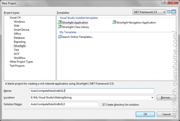
Creating Silverlight Project
Fire up Visual Studio 2008 and create a Silverlight Application. Name it as AutoComlpeteDataGridInSL3.
Go ahead and add a DataGrid to your application.
Now add a Class to define properties for sample data.
public class Users: INotifyPropertyChanged
{
#region INotifyPropertyChanged Members
public event PropertyChangedEventHandler PropertyChanged;
#endregion
#region UserName
private string _UserName;
public string UserName
{
get { return _UserName; }
set
{
if (value.Length < 4)
{
throw new ValidationException("User Name should contain atleast 4 chars");
}
_UserName = value;
RaisePropertyChanged("UserName");
}
}
#endregion
#region Age
private int _Age;
public int Age
{
get { return _Age; }
set
{
_Age = value;
}
}
#endregion
#region Gender
private string _Gender;
public string Gender
{
get { return _Gender; }
set
{
_Gender = value;
}
}
#endregion
#region Country
private string _Country;
public string Country
{
get { return _Country; }
set
{
_Country = value;
}
}
#endregion
private void RaisePropertyChanged(string propertyName)
{
if (this.PropertyChanged != null)
{
this.PropertyChanged(this, new PropertyChangedEventArgs(propertyName));
}
}
}
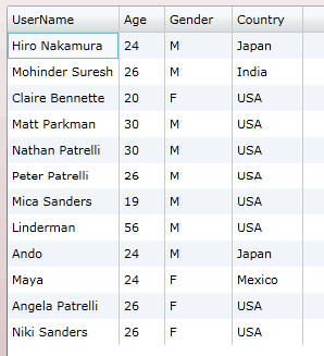
Now add some sample data to a List and assign the list to the ItemSource of the DataGrid.
public MainPage()
{
InitializeComponent();
List<Users> myList = new List<Users>
{
new Users{ UserName="Hiro Nakamura", Age=24, Gender="M", Country="Japan"},
new Users{ UserName="Mohinder Suresh", Age=26, Gender="M", Country="India"},
new Users{ UserName="Claire Bennette", Age=20, Gender="F", Country="USA"},
new Users{ UserName="Matt Parkman", Age=30, Gender="M", Country="USA"},
new Users{ UserName="Nathan Patrelli", Age=30, Gender="M", Country="USA"},
new Users{ UserName="Peter Patrelli", Age=26, Gender="M", Country="USA"},
new Users{ UserName="Mica Sanders", Age=19, Gender="M", Country="USA"},
new Users{ UserName="Linderman", Age=56, Gender="M", Country="USA"},
new Users{ UserName="Ando", Age=24, Gender="M", Country="Japan"},
new Users{ UserName="Maya", Age=24, Gender="F", Country="Mexico"},
new Users{ UserName="Angela Patrelli", Age=26, Gender="F", Country="USA"},
new Users{ UserName="Niki Sanders", Age=26, Gender="F", Country="USA"},
};
MyDataGrid.ItemsSource = myList;
}
Now that you have added some sample data, you can test your application.
Now we don't need to have AutoGenerateColumns of the DataGrid as we are going to define our own.
Follow the xaml code behind for a template:
<data:DataGrid x:Name="MyDataGrid" Margin="0" Grid.Row="1" Grid.Column="1"IsReadOnly="False" AutoGenerateColumns="False">
<data:DataGrid.Columns>
<data:DataGridTextColumn Binding="{Binding Age}" Header="Age" />
<data:DataGridTemplateColumn Header="User Name">
<data:DataGridTemplateColumn.CellTemplate>
<DataTemplate>
<TextBlock Text="{Binding UserName}" Margin="4" />
</DataTemplate>
</data:DataGridTemplateColumn.CellTemplate>
<data:DataGridTemplateColumn.CellEditingTemplate>
<DataTemplate>
<input:AutoCompleteBox
HorizontalAlignment="Left"
Width="180"
IsTabStop="True"
Text="{Binding UserName, Mode=TwoWay}"
ItemsSource="{StaticResource SampleHeroes}"
/>
</DataTemplate>
</data:DataGridTemplateColumn.CellEditingTemplate>
</data:DataGridTemplateColumn>
<data:DataGridTextColumn Binding="{Binding Gender}" Header="Gender" />
<data:DataGridTextColumn Binding="{Binding Country}" Header="Country" />
</data:DataGrid.Columns>
</data:DataGrid>
As you can see from the above xaml code the columns are bound to respective properties. For UserName we have a CellEditingTemplate, where we have used an AutoCompleteBox.
Now create a class named ObjectCollection and define the two constructors as follows:
public class ObjectCollection: Collection<object>
{
public ObjectCollection()
{
}
public ObjectCollection(IEnumerable collection)
{
foreach (object obj in collection)
{
Add(obj);
}
}
}
Add a sample ObjectCollection in xaml code behind.
<UserControl.Resources>
<local:ObjectCollection x:Key="SampleHeroes">
<sys:String>Jack Sephered</sys:String>
<sys:String>James Soyer</sys:String>
<sys:String>John Lock</sys:String>
<sys:String>Jacky Chan</sys:String>
</local:ObjectCollection>
</UserControl.Resources>
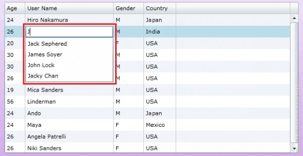
That's it we are done with this. Run your application.
Edit the User Name Column of any row and start typing with the letter "J" (as we have only fields starting with J).
You will be prompted with the List of values from the AutoCompleteBox:
